


You only get a few seconds to make a first impression online. If visitors land on your website and feel even a little confused, they’re gone. It doesn’t matter how great your work is or how strong your reputation might be. The good news? With a few practical website user experience tips, you can make your site feel clear, intuitive, and inviting without rebuilding everything from scratch.
It all comes down to clarity, flow, and helping your visitors instantly understand what you do and why it matters to them.
BTW: If your site doesn’t feel quite right anymore, you might also like 5 Signs It’s Time for a Website Redesign.

When Design Alone Isn’t Enough
Even the prettiest website can fall flat if people don’t know where to click or what to do next. I’ve seen so many women entrepreneurs pour their hearts into design only to lose potential clients over minor UX issues.
Great design isn’t just about how your website looks. It’s about how it feels to use.
If the experience is confusing, overwhelming, or unclear, your visitors feel that immediately, and they leave just as quickly.
That’s where thoughtful website user experience tips really matter. Small adjustments can completely change how confident and supported your visitors feel as they move through your site.
5 Signs Your Website Might Be Confusing (and How to Fix Each One)
If any of these sound familiar, it’s a good sign your site could use a UX refresh.
1. You have too much text on your homepage.
If someone needs to scroll forever or read long paragraphs to understand what you do, they’ll tune out. Visitors skim. It’s just how most people use the internet.
The Fix:
Use simple, direct headlines that speak to your audience’s needs. Break long paragraphs into short, skimmable sections with subheadings that guide the eye. Aim for clarity over cleverness.
2. Your calls to action aren’t clear.
Every page should lead someone toward the next logical step. If a visitor isn’t sure what to do—book, contact, read more—they’ll leave instead of guessing.
The Fix:
Make your CTAs obvious and approachable. Use a clear button style, intentional spacing, and simple language like “Book a Call,” “Start Your Project,” or “Get in Touch.” Avoid vague phrases that make people think too hard.

3. Your branding feels inconsistent.
When your colors, fonts, or tone shift from page to page, everything feels disjointed. Even small inconsistencies can make your brand feel less professional.
The Fix:
Stick to your brand guidelines. Use the same color palette, fonts, spacing, and voice throughout your site. That consistency builds trust and makes your whole site feel more polished.
Need help tightening up your branding across platforms? My Design Day Intensives might be a good fit.
4. It’s not clear who your site is for.
If your copy speaks to everyone, it connects with no one.
The Fix:
Write directly to your ideal client. Use “you” language, reflect their goals, and speak to their real challenges. Tell them what you do, who you help, and why it matters.
Visitors need to feel like you understand them. This is one of the simplest website user experience tips, and it makes a huge difference.
5. It’s not optimized for mobile.
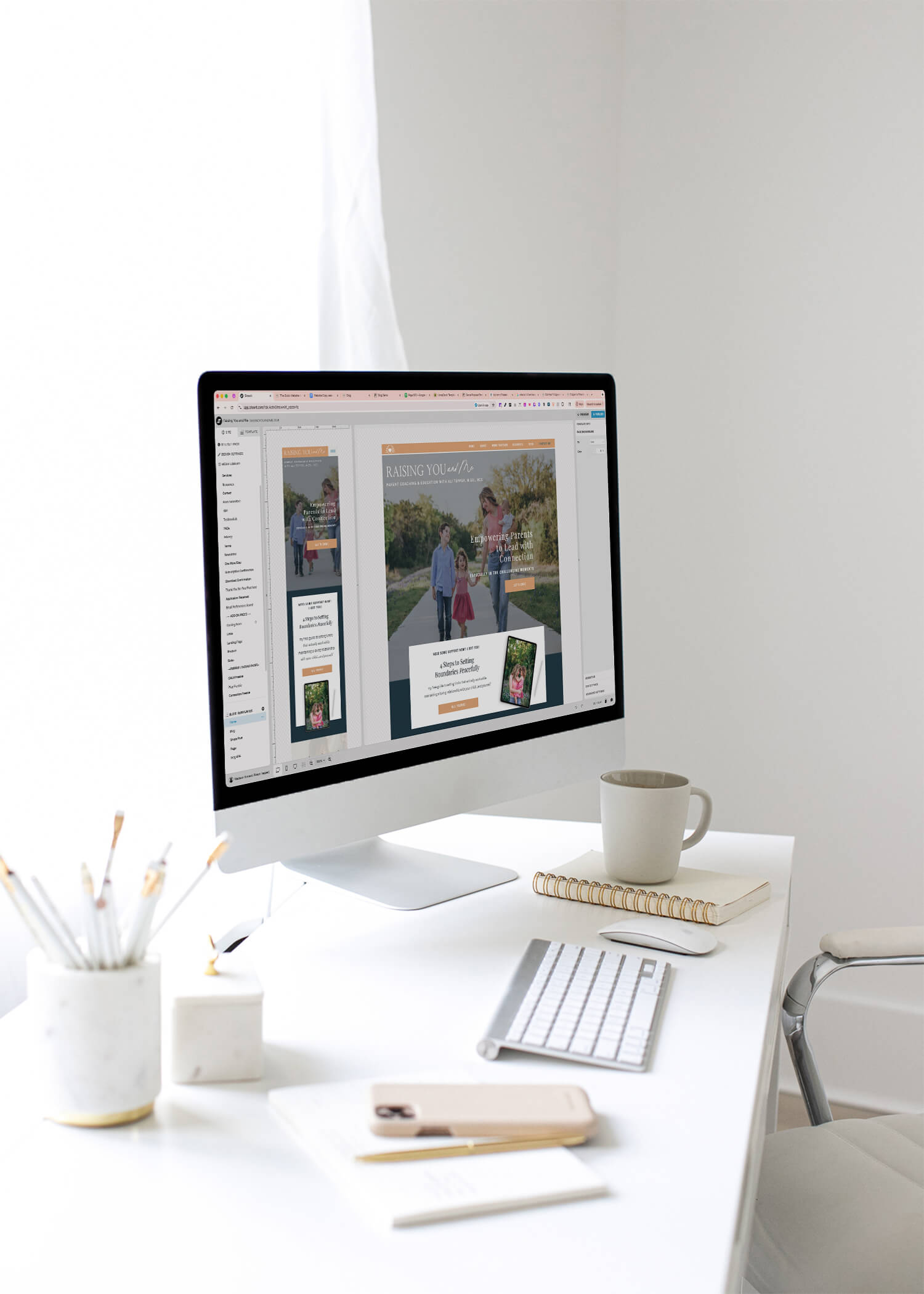
Most people are browsing on their phones, not on desktop. On a platform like Showit, your mobile site is designed separately, which is amazing for customization. But it also means it’s easy to forget small details like spacing, tap targets, and how your images stack.
The Fix:
Always preview your mobile layout as you design. (On your actual phone as well, not just your website platform’s mobile preview!) Check your spacing. Make sure text isn’t too small. Ensure that CTAs are easy to tap and that your images aren’t blocking key info.
A mobile-friendly site is non-negotiable.
Clarity Is What Converts
User experience isn’t about perfection. It’s about empathy. When you make your site easy to navigate, you’re respecting your visitors’ time and attention. That ease builds trust, and trust is what leads to conversions.
Simple, thoughtful adjustments can completely change the way people interact with your brand online.
A Quick Website Checkup
Here are a few simple checks you can run today. If you answer “no” or “I’m not sure” to any of them, there’s room to improve the user experience.
- Can someone tell what you do in five seconds?
- Is there one clear CTA on every page?
- Does your site feel consistent from top to bottom?
- Is your mobile experience smooth and easy?
- Does your site reflect the level your business is at now?
These questions create a solid starting point—not for perfection, but for clarity and confidence.
Need to check your site with fresh eyes?
📥 Grab my free Website Audit Checklist for small fixes that make a big difference.
🖥️ Want deeper support? Explore my Showit Web Design Service.